MATT SCOTT BARNES
Research, Documentation and Daily Making
It’s Hunter/Gatherer not Hunter/Gatekeeper
Short Essay coming out in a future publication
2023
Today, I sat down to put together a Spotify playlist. I wanted to approach it the way I did as a teenager, recording each track onto a cassette tape in real time before moving on to the next. Waiting for each song to end before adding the next one really changes your pre-determined choices. Amidst a track memories of other songs that I had almost forgotten, but will now go on and add to this playlist.
My life has been a series of mixing together experiences that have formed my identity. As a graphic designer, I have built my abilities by learning from many schools of process, constantly pushing my boundaries to relearn things I’ve found natural. Growing up fascinated in punk music, which began in my teenage years, has instilled in me a drive for my community, alternative tools, and my own voice. As a borderline hoarder, I have amassed an eclectic collection of items that reflect my interests, from collected ephemera, Japanese vinyl toys, vintage mopeds, and rare vinyl records. However, my fear of gatekeeping is perhaps a large calling to me. As I was coming up in my practice I found many colleagues with held learned tricks or sources to help themselves in a promotion. This feeling of exclusion has driven me to be more accepting and inclusive of others and to create spaces where everyone feels welcome. Despite the seemingly unrelated nature of these topics, they have all contributed to who I am as a person and as a professional. A common thread is an idea of using visual imagery to create a sense of identity, belonging, and ownership.
Punk rock emerged in the mid-1970s as a countercultural movement to reject mainstream values and aesthetics. It embodied a DIY ethos that extended to its visual executions. Punk flyers, posters, and album covers were often created using cut-and-paste techniques, photocopiers, and other low-cost materials. These designs were raw, unpolished, and chaotic, reflecting the punk ethos of rejecting established norms and embracing individuality. The visual language created by punk design expressed the movement's values and ideals, creating a sense of identity and belonging within the punk community.
The punk movement also embraced a culture of collecting, with many followers amassing extensive collections of low-run produced records, xerox fan zines, screen print posters, and other similar items. Music collectors are known for their passion and tendency to seek out hard-to-find relics. They scour the internet, music stores, and other sources to obtain obscure items that they can add to their collections. In fact, they often go to great lengths to acquire these rare pieces, such as trading with other collectors or even traveling to other countries to source them. This pursuit is not just about building a collection, but rather a labor of love to preserve the art and history of the movement for future generations to appreciate.
In addition to collecting, fans also created their own zines, which were self-published magazines that covered topics such as music, politics, and social issues. These zines would often include interviews with bands, reviews of albums, and articles about various aspects of punk culture. Posters were also popular among fans, with many featuring striking graphics and bold designs that helped to promote upcoming shows and events.
Overall, the obtaining of these items was just an aspect of punk culture, but not defining the movement as a whole. Collecting was a way of connecting with like-minded individuals, and small collections represented status within the culture.
Graphic design has played a key role in both punk rock and collecting culture. Punk culture was not just a style, but it was an entire movement that expressed itself through music, fashion, and art. The design was a crucial component of the punk visual language, as it reflected the values and ideals of the movement. Punk design was all about being raw, unconventional, and rebellious. It was about breaking the norms of mainstream society and creating something new and different. The punk aesthetic was characterized by bold graphics, DIY ethos, and anti-authoritarianism. It was a way of expressing individuality and challenging the status quo. In essence, punk design was about pushing boundaries and creating a cultural revolution through art and design. In collecting culture, design was more than just a way of connecting with a larger community of like-minded individuals. It was a way of expressing one's own identity and values, while also learning from the values of others. In fact, many collectors would often spend a great deal of time researching the history and cultural significance of the objects they collected, in order to better understand the movement. Additionally, design played a crucial role in shaping the way that people interacted with each other and with their environment. By studying the design choices of different cultures and time periods, collectors were able to gain a deeper appreciation for the diversity of human experience and the ways in which people have sought to create beauty and meaning throughout history. In both cases, the design was a way of creating a personal identity.
However, the distinction between collecting, hoarding, and gatekeeping can be subtle. It's important to understand that collecting is a conscious choice made by individuals who have a genuine interest in collecting certain items. Hoarding, on the other hand, is a compulsive behavior that involves the uncontrollable accumulation of objects, often to the point of creating clutter and chaos in one's living space. Gatekeeping, similar to hoarding, involves the desire to accumulate objects, but with the added element of controlling or limiting access to those objects by others. It's crucial to recognize and respect the differences between these behaviors in order to better understand and appreciate the motivations behind them.
As a potential hoarder, it is important to be aware of the potential dangers of hoarding and to create healthier alternatives to collecting physical media. For example, we can create shareable digital storage that allows for the same sense of collecting while being able to share with future admirers of similar interests.
In conclusion, it is worth noting that graphic design, punk rock, and collecting share a common thread. These things we absorb and surround ourselves with shape our identity, and give us a home of our choosing.
Graphic design, for instance, can create a language that speaks to a particular subculture or community, like punk rock often using a do-it-yourself aesthetic that pushes unconventional or anti-establishment messaging. Similarly, your collection can be seen as a form of visual expression, as individuals surround themselves with objects that reflect their personalities and interests.
Ultimately, the power of visual imagery to shape our sense of self and community is awesome.
Remember don’t be a jerk and share what you have.
Documenting Daily Documenting
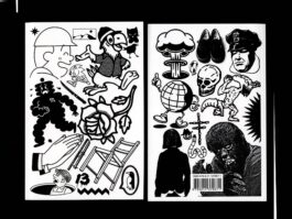
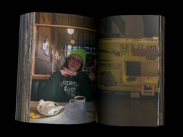
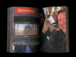
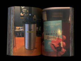
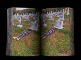
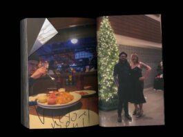
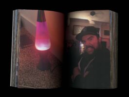
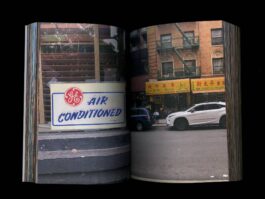
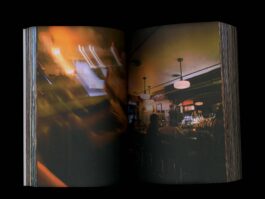
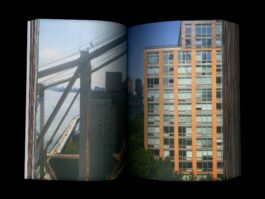
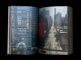
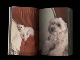
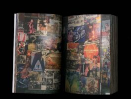
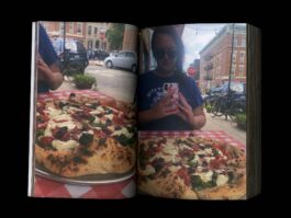
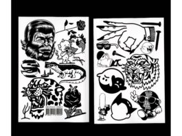
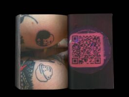
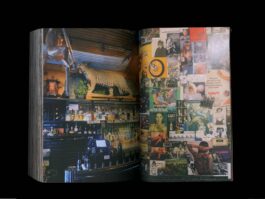
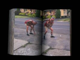
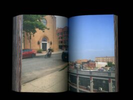
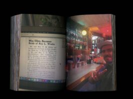
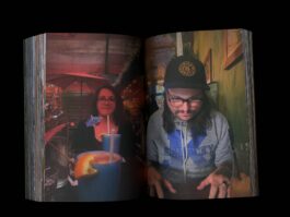
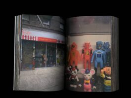
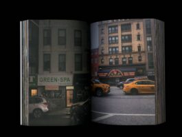
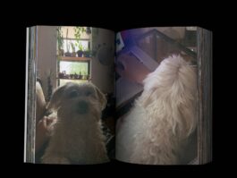
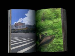
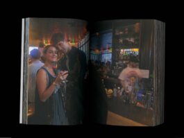
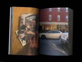
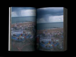
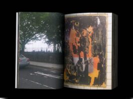
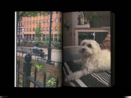
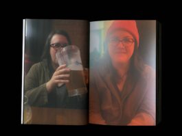
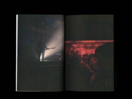
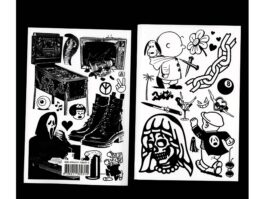
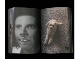
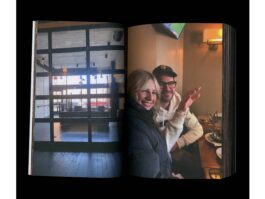
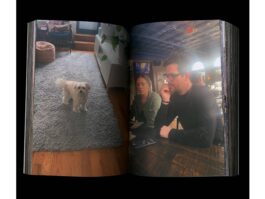
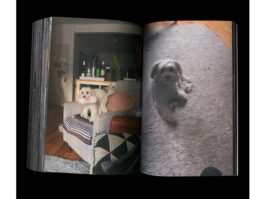
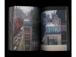
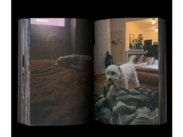
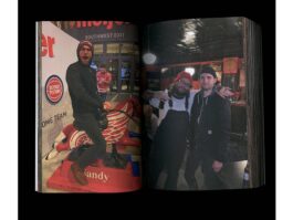
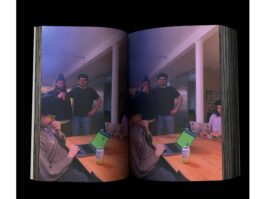
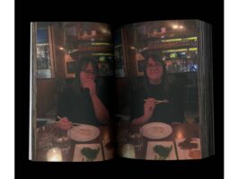
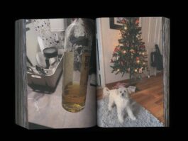
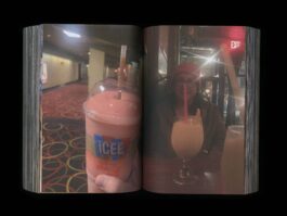
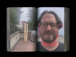
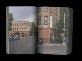
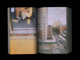
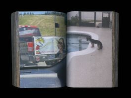
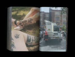
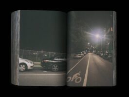
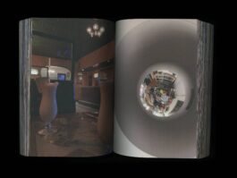
Every year, I make it a point to clear out the photos taken on my cellphone from the previous year. I then arrange the collection across as many spreads as possible, which can be comfortably bound by a digital printer. The shots range from pictures taken at home, traveling, with friends, our pets, and even the awkward findings from my daily life.
This practice allows me to reconnect with the images in a tangible form and also frees up space on my ever-depleting hard drive.
2022 One Sided Documentation
Three Books
Over 1200 pages
Edition 1/1













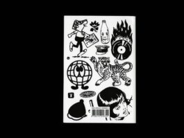
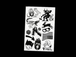
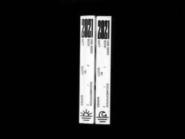
2021 One Sided Documentation
Two Books
Over 750 pages
Edition 1/1
Documentation: 2021 One Sided Documentation
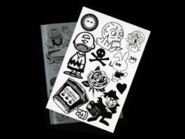
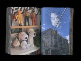


2020 Pandemic
Two Books
Over 700 pages
Edition 1/1
Documentation: 2020 Pandemic


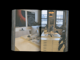
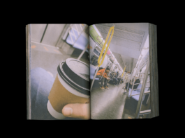


Lecture: From Bawitdaba to da bang da dang diggy.
From Bawitdaba to da bang da dang diggy.
A post-graduate journey to find out how to care less.
10.9-15.2022
I was asked to be a Graduate Assistant at Vermont College of Fine Arts for their fall residency. In addition, we held the first-ever Alumnx Weekend, during which I presented a talk titled "What have you been up to since graduating?" Here is a sample from that presentation:
To quote a contemporary prophet, "From Bawitdaba to da bang da dang diggy."
A post-graduate journey to find out how to care less.
After completing the VCFA program in October 2017, I returned to civilian life in Louisville, Kentucky. I had started a small art gallery while working full-time freelancing. However, I soon realized that my income was not sufficient to meet my financial needs. In order to secure my future, I decided to travel to New York to freelance for short sprints at different agencies. This proved to be a wise decision as it allowed me to pay off some of my credit card debt and my car loan.
My experiences freelancing in New York also helped me to overcome my fear of moving to a big city. With newfound confidence, my partner Kelly and I sold our collected belongings, packed up our house and studio/gallery space, and moved to Brooklyn. To our delight, we both landed jobs within a couple of days of arriving in Brooklyn.
After a couple of months, my friend Chad and I were presented with a large project through our neighbors in the building we were renting from. Working together, we pitched a proposal that was surprisingly accepted. This led us to scramble to brand ourselves, set up an EIN, bank account, and build a proper statement of work. Our hard work paid off, as five years later our business has grown significantly. I am proud to have created an apprenticeship program and implemented a 4-day work week.
To keep my creativity flowing, I also started creating 10-minute posters in the mornings or at the end of the day. This has helped me to stay motivated and hone my design skills. Additionally, I have taught a thesis course to 20 students at the New School on Fridays. I am passionate about teaching and sharing my knowledge with others.
Last week, I became a homeowner and moved from Brooklyn to Cincinnati, where I bought my first lawn mower. This marks a new chapter in my life and I am excited to see what the future holds.
On-Going Warm Ups + Warm Downs
As designers, we're all constantly trying to improve our craft. We often spend hours scouring the web for useful tips and tricks to enhance our design skills. However, while it is important to seek inspiration and learn from others, it is equally important to set aside time for experimentation and creative exploration. By dedicating more time to the process of creating and designing, we can develop our own unique style and perspective, and push the boundaries of what is possible in our field. Additionally, this process can lead to unexpected breakthroughs and discoveries, as well as a deeper understanding of our own strengths and weaknesses as designers. So instead of solely relying on external sources for inspiration, let's make a conscious effort to prioritize the act of creating and designing ourselves.
Here is a collection of warm-up and warm-down exercises that have been created over the years to be used at the start or end of the day.
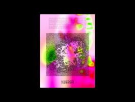
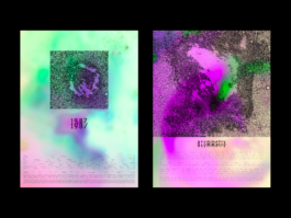
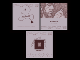
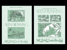
Daily Making: Warm Ups & Warm Downs
Freedom of making anything you want and having learning be fun again.
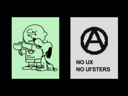
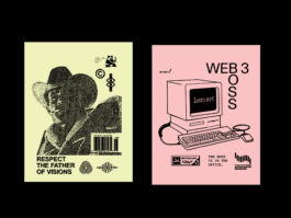
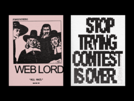
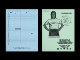
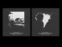
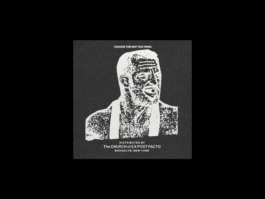
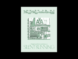
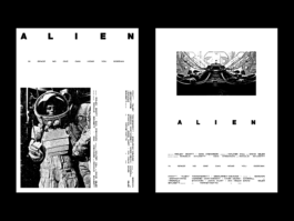
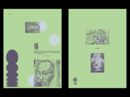
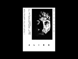
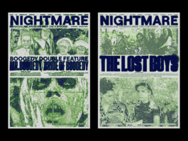
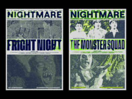
Cyber Goth Chinese Food
Released by BadTypeClub
2018
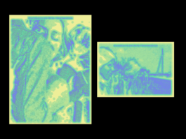
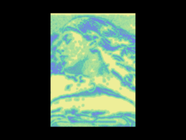
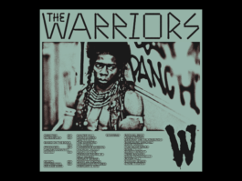
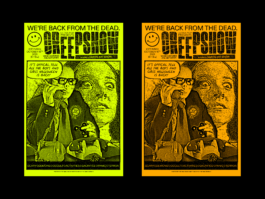
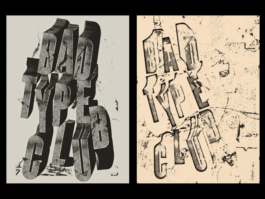
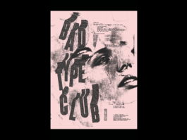
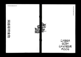
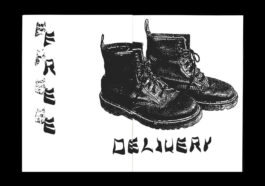
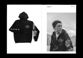
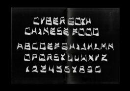
Cyber Goth Chinese Food is a unique display typeface that merges the northeastern graffiti hand styles and the "cut-onions" style typography commonly used for Chinese takeout. The result is a bold and eye-catching typeface that blends two seemingly contrasting subcultures to create a distinctive and memorable design.
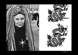
This typeface was inspired by the hand styles featured across New York, which often represent ownership and individuality. By fusing this with the misrepresented and often offensive ethnic typefaces intended to express an Asian or Chinese aesthetic, Cyber Goth Chinese Food produces a unique juxtaposition.
The result is a typeface that is both Intense and romantic, combining elements of street art with a touch of low-brow elegance. The unique blend of northeastern graffiti hand styles and the "cut-onions" style typography is what sets Cyber Goth Chinese Food apart from other Orientalism-based typefaces. This distinct combination creates a completely new aesthetic that is both visually striking and neo-culturally relevant.
Research: Cyber Goth Chinese Food
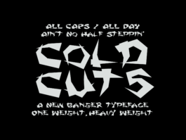
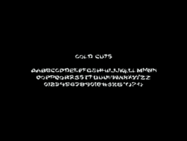
Cold Cuts
Released through BadTypeClub
Collaboration with Kelly Scheurich
2020
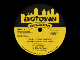
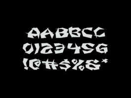
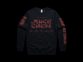
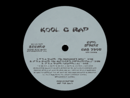
I revisited this project during the lockdown of 2020. I collaborated with Kelly Scheurich and approached the concept of creating a typeface in the same manner, using thick-to-thin shapes to generate brush-like glyphs, similar to a brush script. Once we finished the initial glyphs, we decided to build proofs-of-concept examples featuring some of our favorite hip-hop artists from the past. The thought was to move away from restaurants in general and focus on a forward-thinking movement.
Research: Cold Cuts
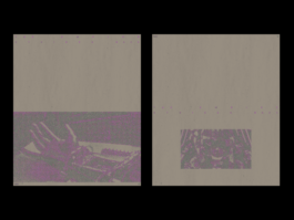
Visual Repairment
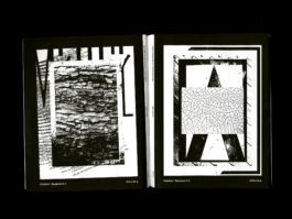
Published by UsByUs
Size: 8 in x 10 in
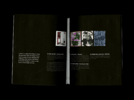
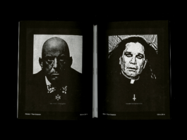
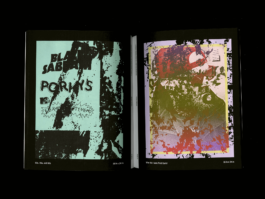
When it comes to digesting written histories and theories, I've found that combining visual responses with written ones allows me to retain larger amounts of content. As a result, I produced a publication that included collected posters along with written content.
Research & Documentation: Visual Repairment





Research: Bending Spoons with Britney Spears by Chuck Klosterman
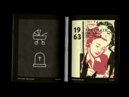
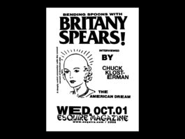
Bending Spoons with Britney Spears
Chuck Klosterman
I found the conversation between Klosterman and Britney Spears to be quite interesting. The way in which Klosterman tried to dig at Britney's persona in order to get her to open up was quite fascinating, it was funny to see Britney counter with a dumbfounded response. Klosterman even asked if she was genuinely that foolish or if she was on some sort of Kaufman level of marketing. It was quite an intriguing moment, and it made me wonder whether Britney was simply playing dumb or if she was truly as clueless as she seemed.
One thing that struck me about the interview was the idea that Britney was told to simply "play dumb" and to only respond with predetermined lines that had been written by marketers. It seems that Britney was being used as a puppet to sell a particular image or persona, and that she had little control over her own public image. This makes me feel badly for Britney, as it seems that she was being manipulated for her fame and that she had little say in the matter.
The interview pushed me to think about the Britney Spears infatuation that occurred back in 1998. At the time, I was 15 years old, and I remember spending most of my nights listening to "Slowly Going the Way of the Buffalo" by (then) Christian Pop Punk band MxPx It was a great album. One night, my friend Angela and I were watching TV when we stumbled upon the video for "Baby One More Time." We both laughed at the video, mostly at the idea that it was going to be the next big thing, and the expectations of hearing about it at school the next day. Angela, who a few years earlier was infatuated with boy bands like Boys II Men and NSync, had a response that stuck out to me: "It's crazy what 12-year-olds will fall into." It doesn't sound particularly profound now, but it was interesting to think about two 15-year-olds chatting about iconic advertisements.
Overall, I found Klosterman's interview with Britney to be quite fascinating, and it made me want to learn more about the music industry and the way in which artists are marketed to the public.
Best take away, listen to MxPx again.
Response: Bending Spoons with Britney Spears by Chuck Klosterman
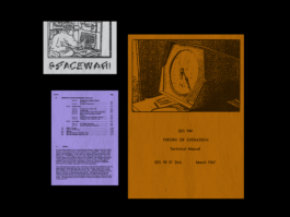
Download Malware.
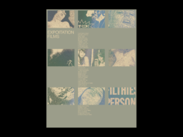
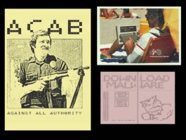
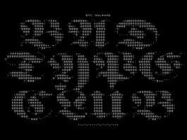
Set in a dystopian futuristic metropolis, Malware is a fresh pixel display face with a strong cyberpunk influence. The contrast is heavy and horizontal in some weights and vertical in others. The entire set is designed to be timeless, fitting into a 70s exploitation film or a superhero UI screen.
Built on a modular system, a grid is created using a five-by-seven cell structure as the base.
Research: Malware




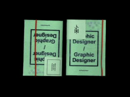
Research: Graphic Designer as Graphic Designer
Graphic Designer as Graphic Design
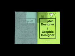
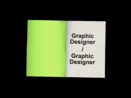
Published by Mister Sister Short Runs © 2017
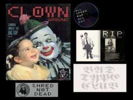
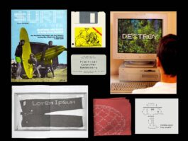
This is a publication that my friend and I wrote while in graduate school, late one night during residency. Its purpose is to remind us (then and now) not to hide behind the array of collected titles we accumulate like shells on a beach but instead to rekindle the initial push that drove us to become graphic designers.
Less talk, more rock.
Here is the introduction to the writing:
It's times like these when I get excited about the present and frustrated with the past. It's like the bumper sticker that reads "Realize. Real Eyes. Real Lies." It's deep, you know what I mean? Like the flea markets of the Midwest producing artifacts of a desolate future of graphic design, we have these heroes to thank. Thank you for your champion letters cast across the web made of hot sauce. Thank you for reminding me that you grew up in Michigan and still like to snowboard. Thank you for living in Brooklyn and drawing on napkins. Thank you for writing the books that no one wants to read but wants to share on their bookshelves. Thank you for criticizing others to hide your own sad existence. Thank you for teaching workshops that turn good designers into bad designers. And thank you for reminding us that art direction is as easy as shoving fruit in some lady's sock and collecting a check. Most of all, thank you, reader, for reading this outright absurdity.
Response: Graphic Designer as Graphic Designer
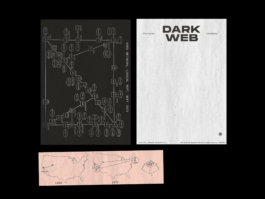
Dark Scripture
Released by BadTypeClub
2018


MATT SCOTT BARNES
Research, Documentation and Daily Making
It’s Hunter/Gatherer not Hunter/Gatekeeper
Short Essay coming out in a future publication
2023
Today, I sat down to put together a Spotify playlist. I wanted to approach it the way I did as a teenager, recording each track onto a cassette tape in real time before moving on to the next. Waiting for each song to end before adding the next one really changes your pre-determined choices. Amidst a track memories of other songs that I had almost forgotten, but will now go on and add to this playlist.
My life has been a series of mixing together experiences that have formed my identity. As a graphic designer, I have built my abilities by learning from many schools of process, constantly pushing my boundaries to relearn things I’ve found natural. Growing up fascinated in punk music, which began in my teenage years, has instilled in me a drive for my community, alternative tools, and my own voice. As a borderline hoarder, I have amassed an eclectic collection of items that reflect my interests, from collected ephemera, Japanese vinyl toys, vintage mopeds, and rare vinyl records. However, my fear of gatekeeping is perhaps a large calling to me. As I was coming up in my practice I found many colleagues with held learned tricks or sources to help themselves in a promotion. This feeling of exclusion has driven me to be more accepting and inclusive of others and to create spaces where everyone feels welcome. Despite the seemingly unrelated nature of these topics, they have all contributed to who I am as a person and as a professional. A common thread is an idea of using visual imagery to create a sense of identity, belonging, and ownership.
Punk rock emerged in the mid-1970s as a countercultural movement to reject mainstream values and aesthetics. It embodied a DIY ethos that extended to its visual executions. Punk flyers, posters, and album covers were often created using cut-and-paste techniques, photocopiers, and other low-cost materials. These designs were raw, unpolished, and chaotic, reflecting the punk ethos of rejecting established norms and embracing individuality. The visual language created by punk design expressed the movement's values and ideals, creating a sense of identity and belonging within the punk community.
The punk movement also embraced a culture of collecting, with many followers amassing extensive collections of low-run produced records, xerox fan zines, screen print posters, and other similar items. Music collectors are known for their passion and tendency to seek out hard-to-find relics. They scour the internet, music stores, and other sources to obtain obscure items that they can add to their collections. In fact, they often go to great lengths to acquire these rare pieces, such as trading with other collectors or even traveling to other countries to source them. This pursuit is not just about building a collection, but rather a labor of love to preserve the art and history of the movement for future generations to appreciate.
In addition to collecting, fans also created their own zines, which were self-published magazines that covered topics such as music, politics, and social issues. These zines would often include interviews with bands, reviews of albums, and articles about various aspects of punk culture. Posters were also popular among fans, with many featuring striking graphics and bold designs that helped to promote upcoming shows and events.
Overall, the obtaining of these items was just an aspect of punk culture, but not defining the movement as a whole. Collecting was a way of connecting with like-minded individuals, and small collections represented status within the culture.
Graphic design has played a key role in both punk rock and collecting culture. Punk culture was not just a style, but it was an entire movement that expressed itself through music, fashion, and art. The design was a crucial component of the punk visual language, as it reflected the values and ideals of the movement. Punk design was all about being raw, unconventional, and rebellious. It was about breaking the norms of mainstream society and creating something new and different. The punk aesthetic was characterized by bold graphics, DIY ethos, and anti-authoritarianism. It was a way of expressing individuality and challenging the status quo. In essence, punk design was about pushing boundaries and creating a cultural revolution through art and design. In collecting culture, design was more than just a way of connecting with a larger community of like-minded individuals. It was a way of expressing one's own identity and values, while also learning from the values of others. In fact, many collectors would often spend a great deal of time researching the history and cultural significance of the objects they collected, in order to better understand the movement. Additionally, design played a crucial role in shaping the way that people interacted with each other and with their environment. By studying the design choices of different cultures and time periods, collectors were able to gain a deeper appreciation for the diversity of human experience and the ways in which people have sought to create beauty and meaning throughout history. In both cases, the design was a way of creating a personal identity.
However, the distinction between collecting, hoarding, and gatekeeping can be subtle. It's important to understand that collecting is a conscious choice made by individuals who have a genuine interest in collecting certain items. Hoarding, on the other hand, is a compulsive behavior that involves the uncontrollable accumulation of objects, often to the point of creating clutter and chaos in one's living space. Gatekeeping, similar to hoarding, involves the desire to accumulate objects, but with the added element of controlling or limiting access to those objects by others. It's crucial to recognize and respect the differences between these behaviors in order to better understand and appreciate the motivations behind them.
As a potential hoarder, it is important to be aware of the potential dangers of hoarding and to create healthier alternatives to collecting physical media. For example, we can create shareable digital storage that allows for the same sense of collecting while being able to share with future admirers of similar interests.
In conclusion, it is worth noting that graphic design, punk rock, and collecting share a common thread. These things we absorb and surround ourselves with shape our identity, and give us a home of our choosing.
Graphic design, for instance, can create a language that speaks to a particular subculture or community, like punk rock often using a do-it-yourself aesthetic that pushes unconventional or anti-establishment messaging. Similarly, your collection can be seen as a form of visual expression, as individuals surround themselves with objects that reflect their personalities and interests.
Ultimately, the power of visual imagery to shape our sense of self and community is awesome.
Remember don’t be a jerk and share what you have.
2021 One Sided Documentation
Two Books
Over 750 pages
Edition 1/1
Documentation: 2021 One Sided Documentation


2020 Pandemic
Two Books
Over 700 pages
Edition 1/1
Documentation: 2020 Pandemic


Lecture: From Bawitdaba to da bang da dang diggy.
From Bawitdaba to da bang da dang diggy.
A post-graduate journey to find out how to care less.
10.9-15.2022
I was asked to be a Graduate Assistant at Vermont College of Fine Arts for their fall residency. In addition, we held the first-ever Alumnx Weekend, during which I presented a talk titled "What have you been up to since graduating?" Here is a sample from that presentation:
To quote a contemporary prophet, "From Bawitdaba to da bang da dang diggy."
A post-graduate journey to find out how to care less.
After completing the VCFA program in October 2017, I returned to civilian life in Louisville, Kentucky. I had started a small art gallery while working full-time freelancing. However, I soon realized that my income was not sufficient to meet my financial needs. In order to secure my future, I decided to travel to New York to freelance for short sprints at different agencies. This proved to be a wise decision as it allowed me to pay off some of my credit card debt and my car loan.
My experiences freelancing in New York also helped me to overcome my fear of moving to a big city. With newfound confidence, my partner Kelly and I sold our collected belongings, packed up our house and studio/gallery space, and moved to Brooklyn. To our delight, we both landed jobs within a couple of days of arriving in Brooklyn.
After a couple of months, my friend Chad and I were presented with a large project through our neighbors in the building we were renting from. Working together, we pitched a proposal that was surprisingly accepted. This led us to scramble to brand ourselves, set up an EIN, bank account, and build a proper statement of work. Our hard work paid off, as five years later our business has grown significantly. I am proud to have created an apprenticeship program and implemented a 4-day work week.
To keep my creativity flowing, I also started creating 10-minute posters in the mornings or at the end of the day. This has helped me to stay motivated and hone my design skills. Additionally, I have taught a thesis course to 20 students at the New School on Fridays. I am passionate about teaching and sharing my knowledge with others.
Last week, I became a homeowner and moved from Brooklyn to Cincinnati, where I bought my first lawn mower. This marks a new chapter in my life and I am excited to see what the future holds.
On-Going Warm Ups + Warm Downs
As designers, we're all constantly trying to improve our craft. We often spend hours scouring the web for useful tips and tricks to enhance our design skills. However, while it is important to seek inspiration and learn from others, it is equally important to set aside time for experimentation and creative exploration. By dedicating more time to the process of creating and designing, we can develop our own unique style and perspective, and push the boundaries of what is possible in our field. Additionally, this process can lead to unexpected breakthroughs and discoveries, as well as a deeper understanding of our own strengths and weaknesses as designers. So instead of solely relying on external sources for inspiration, let's make a conscious effort to prioritize the act of creating and designing ourselves.
Here is a collection of warm-up and warm-down exercises that have been created over the years to be used at the start or end of the day.
Daily Making: Warm Ups & Warm Downs
Freedom of making anything you want and having learning be fun again.


Cyber Goth Chinese Food
Released by BadTypeClub
2018
Cyber Goth Chinese Food is a unique display typeface that merges the northeastern graffiti hand styles and the "cut-onions" style typography commonly used for Chinese takeout. The result is a bold and eye-catching typeface that blends two seemingly contrasting subcultures to create a distinctive and memorable design.
This typeface was inspired by the hand styles featured across New York, which often represent ownership and individuality. By fusing this with the misrepresented and often offensive ethnic typefaces intended to express an Asian or Chinese aesthetic, Cyber Goth Chinese Food produces a unique juxtaposition.
The result is a typeface that is both Intense and romantic, combining elements of street art with a touch of low-brow elegance. The unique blend of northeastern graffiti hand styles and the "cut-onions" style typography is what sets Cyber Goth Chinese Food apart from other Orientalism-based typefaces. This distinct combination creates a completely new aesthetic that is both visually striking and neo-culturally relevant.
Research: Cyber Goth Chinese Food


Cold Cuts
Released through BadTypeClub
Collaboration with Kelly Scheurich
2020
I revisited this project during the lockdown of 2020. I collaborated with Kelly Scheurich and approached the concept of creating a typeface in the same manner, using thick-to-thin shapes to generate brush-like glyphs, similar to a brush script. Once we finished the initial glyphs, we decided to build proofs-of-concept examples featuring some of our favorite hip-hop artists from the past. The thought was to move away from restaurants in general and focus on a forward-thinking movement.
Research: Cold Cuts


Visual Repairment
Published by UsByUs
Size: 8 in x 10 in
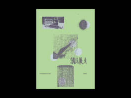
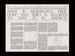
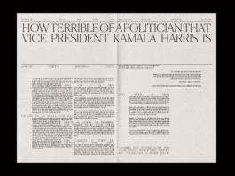
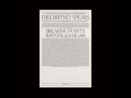
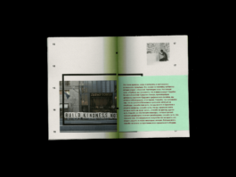
When it comes to digesting written histories and theories, I've found that combining visual responses with written ones allows me to retain larger amounts of content. As a result, I produced a publication that included collected posters along with written content.
Research & Documentation: Visual Repairment


Research: Bending Spoons with Britney Spears by Chuck Klosterman
Bending Spoons with Britney Spears
Chuck Klosterman
I found the conversation between Klosterman and Britney Spears to be quite interesting. The way in which Klosterman tried to dig at Britney's persona in order to get her to open up was quite fascinating, it was funny to see Britney counter with a dumbfounded response. Klosterman even asked if she was genuinely that foolish or if she was on some sort of Kaufman level of marketing. It was quite an intriguing moment, and it made me wonder whether Britney was simply playing dumb or if she was truly as clueless as she seemed.
One thing that struck me about the interview was the idea that Britney was told to simply "play dumb" and to only respond with predetermined lines that had been written by marketers. It seems that Britney was being used as a puppet to sell a particular image or persona, and that she had little control over her own public image. This makes me feel badly for Britney, as it seems that she was being manipulated for her fame and that she had little say in the matter.
The interview pushed me to think about the Britney Spears infatuation that occurred back in 1998. At the time, I was 15 years old, and I remember spending most of my nights listening to "Slowly Going the Way of the Buffalo" by (then) Christian Pop Punk band MxPx It was a great album. One night, my friend Angela and I were watching TV when we stumbled upon the video for "Baby One More Time." We both laughed at the video, mostly at the idea that it was going to be the next big thing, and the expectations of hearing about it at school the next day. Angela, who a few years earlier was infatuated with boy bands like Boys II Men and NSync, had a response that stuck out to me: "It's crazy what 12-year-olds will fall into." It doesn't sound particularly profound now, but it was interesting to think about two 15-year-olds chatting about iconic advertisements.
Overall, I found Klosterman's interview with Britney to be quite fascinating, and it made me want to learn more about the music industry and the way in which artists are marketed to the public.
Best take away, listen to MxPx again.
Response: Bending Spoons with Britney Spears by Chuck Klosterman

Download Malware.
Set in a dystopian futuristic metropolis, Malware is a fresh pixel display face with a strong cyberpunk influence. The contrast is heavy and horizontal in some weights and vertical in others. The entire set is designed to be timeless, fitting into a 70s exploitation film or a superhero UI screen.
Built on a modular system, a grid is created using a five-by-seven cell structure as the base.
Research: Malware


Research: Graphic Designer as Graphic Designer
Graphic Designer as Graphic Design
Published by Mister Sister Short Runs © 2017
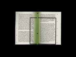
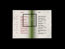
This is a publication that my friend and I wrote while in graduate school, late one night during residency. Its purpose is to remind us (then and now) not to hide behind the array of collected titles we accumulate like shells on a beach but instead to rekindle the initial push that drove us to become graphic designers.
Less talk, more rock.
Here is the introduction to the writing:
It's times like these when I get excited about the present and frustrated with the past. It's like the bumper sticker that reads "Realize. Real Eyes. Real Lies." It's deep, you know what I mean? Like the flea markets of the Midwest producing artifacts of a desolate future of graphic design, we have these heroes to thank. Thank you for your champion letters cast across the web made of hot sauce. Thank you for reminding me that you grew up in Michigan and still like to snowboard. Thank you for living in Brooklyn and drawing on napkins. Thank you for writing the books that no one wants to read but wants to share on their bookshelves. Thank you for criticizing others to hide your own sad existence. Thank you for teaching workshops that turn good designers into bad designers. And thank you for reminding us that art direction is as easy as shoving fruit in some lady's sock and collecting a check. Most of all, thank you, reader, for reading this outright absurdity.
Response: Graphic Designer as Graphic Designer


Dark Scripture
Released by BadTypeClub
2018


