MATT SCOTT BARNES
My approach to teaching graphic design is based on historical research, contemporary practice, critical writing, and open conversation about design theory. I believe it's important to give students a strong foundation in historical research to help them appreciate the evolution of design over time. For example, we can explore how design has been used in different cultural contexts and how it has evolved in response to changing technology.
In addition to this historical perspective, I also believe it's vital to introduce new and innovative ideas about what graphic design can be. Encouraging students to think creatively and outside of the box can help them develop work that is unique and groundbreaking. This may involve exploring new technologies or experimenting with different mediums.
Furthermore, I think it's important for students to develop strong conceptual thinking skills. Rather than simply following current trends or creating work that is ironic in nature, students should think deeply about the ideas behind their work. By building work with strong conceptual thinking, students can create designs that are not only aesthetically pleasing but also have a deeper meaning and purpose.
Finally, I believe open conversation about design theory is key to helping students develop their skills. By discussing different approaches to design and exploring the work of other designers, students can gain a better understanding of the field and develop their own unique voice.
Teaching Experience:
Summer 2025 — Fall 2025
University of Cincinnati / Ullman School of Design
Fall 2025 - Design Research and Methods
Fall 2025 - Typography 3.2
Fall 2025 - Typography 1.1 and 1.2
Summer 2025 - Capstone 1.2
Fall 2021 — Spring 2022
The New School / Parsons School of Design
Spring 2022 - PUCD 4205 Core 4 — Thesis 2 / Class Site
Fall 2021 - PUCD 4205 Core 4 — Thesis 1 / Class Site
Fall 2017
Western Kentucky University / Department of Art & Design
Art 432 — Portfolio / Syllabus
Art 431 — Illustration / Syllabus
Fall 2013
Art Academy of Cincinnati
VCD1 — Typography / Syllabus
VCD3 — Integration / Syllabus
Project Two
Fall 2025 / University of Cincinnati / Design Research Methods
The second project asked students to move beyond speculation and into consequence. Building on the shared methods introduced earlier in the semester, this phase centered on identifying a real-world problem and following it through a disciplined research process toward a resolved design outcome. The emphasis was not on novelty for its own sake, but on developing a solution that could be argued, evidenced, and clearly communicated.
Students began by revisiting problem framing, refining their initial assumptions into focused, defensible problem statements. Using the AEIOU observation framework, they examined activities, environments, interactions, objects, and users to ground their thinking in lived experience rather than abstraction. This observational work was paired with benchmark research, requiring students to study how similar problems have been addressed across different industries, regions, or cultural contexts. Interviews and surveys extended this research further, allowing students to collect primary data and test their ideas against real user perspectives.
To synthesize their findings, students produced image and mood boards to establish visual and tonal direction, and used affinity diagramming to cluster insights, surface patterns, and identify key user needs. These tools functioned as connective tissue between research and design, helping students translate complexity into clarity.
The design phase focused on developing a product, branding system, or service concept that directly responded to the defined problem. Students were expected to articulate not just what they made, but why they made it, supporting their decisions with research insights and documented rationale. Mockups and prototypes were used to test and communicate ideas rather than to simply polish outcomes.
The project concluded with a final case study presentation structured to mirror professional practice. Each team presented their research process, distilled insights, refined problem definition, and final design solution as a coherent narrative. The case study format reinforced the idea that design credibility comes from process made visible, where analysis, experimentation, and decision-making are inseparable from the final result.
Throughout the project, collaboration was treated as a design constraint in itself. Teams were encouraged to assign and rotate roles such as researcher, designer, documenter, and presenter, ensuring shared ownership of both thinking and execution. Regular check-ins helped maintain momentum, while short, focused exercises in AEIOU observation, benchmarking, and affinity mapping scaffolded learning before full application. Visual documentation, from sketches to screenshots, was emphasized as a practical strategy for easing the transition from research to case study and reinforcing design as a communicative act.
Snack’d
Liza Wilson, Reece Guthier, & Ellie Esterer
Problem Framing
Students, faculty, and visitors on UC’s campus struggle to find affordable, convenient, and healthy snack options. Existing healthy choices often sell out quickly, are limited to certain buildings, or are not shelf-stable enough to stay stocked. As a result, many people on campus rely on unhealthy snacks because healthier alternatives are hard to find or unavailable when needed.
Solution
SNACK’D is a vending machine that provides customizable and affordable healthy snacks for people on campus; ie: students and professors.
Community Involvement
Snack’d could have pop ups with snack samples, encouraging the community to eat healthier.
Restate Solution
SNACK’D is a vending machine that provides customizable and affordable healthy snacks for people on campus; ie: students and professors.


Cosmic Carnival
Caitlin Berendt, Abigail Raubenolt, & Ruby Sanchez
1. What’s the problem?
Campuses struggle to achieve high levels of student involvement and interest in campus wide activities.
2. What’s the context?
University of Cincinnati’s campus
3. Who is affected?
Direct stakeholders: Students, students involved in campus activities
Indirect stakeholders: UC faculty and sponsors
4. How is it affecting different people?
Who is struggling the most? Students, campus culture
Who benefits (if anyone)? N/A
Are there differences across race, gender, income, geography, etc.? N/A
5. How is it affecting other parts of the world?
Campus green space
Animals around campus
Financial consequences
6. Who might want to keep things the way they are? Why?
The university and/or sponsors worried about financial cost
Problem Framing:
Students at the University of Cincinnati feel isolated from their peers because they don’t know where or how to connect with people on campus.
Research Focus:
How do students respond to temporary events or experiences?
Solution Space:
Event identity, signage, interactive installations
Deliverables:
Posters, banners, event branding guidelines


Found in Cincinnati
Olivia Hesseling, Michael Notar, & Emilio Lanzador
Why Are We Found
People interested in the arts in Cincinnati aren’t aware of events to attend because of lack of general awareness and promotion in one defined space.
Mission
The public of Cincinnati lacks awareness about local arts, artists and venues.
Research
48% of U.S. adults attended at least one in-person arts event between July 2021 and July 2022.
FOUND for you
FOUND is a zine that promotes local arts and music for people in the community who want to engage in these activities.
The Initiative
FOUND would partner with local print shops in Cincinnati to promote economic printing and build community engagement. Eco Conscience efforts would include printing with soy ink on recycled paper.


Operation Fresh
Riley Finan, Yazmyn Kitchen, Maria Langdon, & Emma Olszewski
Initial Problem Space
Local farmers markets in Cincinnati lack cohesive layout and branding, creating a disorganized and stressful experience that limits community connection for shoppers and vendors.
The Context
Farmers Markets often lack dedicated spaces, programs, and visual systems that cater to children’s engagement or the family shopping experience.
As a historic and busy public market, Findlay Market has the potential to evolve into a more inclusive and friendly community space for families.
Who is Affected?
Direct stakeholders: Customers and vendors, families, children
Indirect stakeholders: City of Cincinnati, farmers, local businesses
The Focus
Our project focuses on the way children experience Findlay Market.
We want to create a fun and engaging journey for kids that encourages them to learn more about healthy food options while taking part in fun activities.
The Problem
Families that come to Findlay Market struggle to keep their kids engaged and occupied while they shop around at different vendors.
Our Solution
Operation: Fresh is a Findlay Market Initiative that encourages family attendance by providing a branded experience aimed at engaging children through fun and educational activities.


Mug Buds
Madeline Fay, Francesca Voyten, & Micah Shannon
Problem Space
Independent coffee shops are struggling to stand out from large coffee chains.
Context
The issue takes place within growing cafes in urban and suburban areas, especially universities, creative districts and neighborhood where people gather to socialize, study or work remotely.
Local cafes are used as social hubs yet compete against larger chains that have bigger budgets and more locations.
Who is Affected
Direct stakeholders:
Local cafes & employees, coffee shop patrons
Indirect stakeholders:
Big chain cafes
The Customer
Values friendly baristas, taste, and convenience. Goes daily, spending about $30/week. Chooses chains for convenience, picks locals when accessible or unique, and isn’t influenced by normal community-focused initiatives.
The Barista
Customers choose Starbucks for its speed, convenience, and consistent drinks, often returning multiple times a day. Its strong rewards app—with perks like challenges, freebies, and seasonal promotions—keeps people loyal.
However, while it excels in efficiency and digital incentives, Starbucks lacks the authentic, community-focused “third space” feel that many local cafés offer.
Solution
Mug Buds is an in-store loyalty program that rewards patrons of independent coffee shops with a personalized in-store experience centered around handmade creature mugs, paired with member perks and events, intended to boost business by building customer loyalty and belonging.
How It Works
MugBuds is an independent system that gets installed at local coffee shops.
Members pay an annual fee to adopt a “Mug Bud”—a one-of-a-kind creature mug made by a local artist.
Members get to use their mug each time they visit and get exclusive perks ($1 off each pour, free drinks, and access to member-only nights.)


Mora
Shikha Chatterjee, Joy Pak, & Elliot Myers
MORA is a wellness initiative in partnership with the University of Cincinnati designed to help students truly manage stress and reconnect with balance in their daily lives.
Derived from the Latin word mora, meaning “pause” or “rest”, the brand encourages students to slow down, reflect, and recharge amidst academic and personal pressures.
The project merges thoughtful product design with behavioral wellness research to create a holistic, student-centered experience.
Problem Space
Many students experience overwhelming stress, burnout, and difficulty accessing or engaging with existing wellness resources. The abundance of tools available can feel fragmented or impersonal, leaving students uncertain about where to begin.
What are students’ main stressors, and how do they manage them?
Through qualitative interviews, surveys, and environmental observations, our research explores the underlying causes of student stress, coping mechanisms, and perceptions of wellness programs at UC.
How might we
design a solution and wellness kit pack that helps students identify their main stressors and manage stress in an accessible, engaging, and convenient way?
Survey Results
29.2% of participants wanted stress relief items in their wellness kits
Participants biggest stressors are: Academics, Time Management, and Financial Concerns.
Participants have not used the UC wellness center but know about it
Problem Statement
Mora by UC is a wellness kit and brand that aims to be an aid and help students deal with their stress and mental illness during high stress semesters
How Might We
How might we design a solution that helps students identify their main stressors and manage stress in an accessible, engaging, and convenient way?.
Users
Primarily all University of Cincinnati students, Secondarily faculty & staff ; aimed towards college-going students specific to UC.
Problem Validation
Our survey reflected strong sentiments towards the inefficiency of current wellness resources provided by UC. This evident dissatisfaction as well as the invisibility of current services validates our problem space and scope for a refined design solution.
Final Solution
Our final direction is a series of branded touch points that come together to form a kit that is then delivered to users, providing a personal and comforting unboxing experience.
A Holistic Wellness Ecosystem
Mora by UC functions as an interconnected system designed to support students across multiple layers of their daily life. Each component plays a distinct role (physical tools, guided practices etc.) coming together to create a seamless wellness experience.
The Physical Kit
The Mora kit serves as the entry point into the system. Through tactile, sensory-based items such as the journal, candle, fidget tool, and conversation cards, students receive immediate, low-pressure ways to regulate stress and build awareness.
Guided Reflection
The Mora journal encourages students to pause, name their emotions, and reflect. Its prompts and “Mora Moments” help students develop a mindful routine that fits naturally into academic life, turning self-care into small, achievable habits.
Touch Points
From packaging to printed inserts to the Bearcat-inspired icon, the visual system ensures recognition and consistency. Each touchpoint acts as a gentle reminder to slow down, recharge, and reconnect with oneself.
OPTIONAL DIGITAL EXTENSION
A future companion app extends the experience beyond the box, offering daily check-ins, stress-tracking, grounding exercises, and personalized suggestions. This creates continuity, supporting students both physically and digitally.
Integration
Because Mora is built for UC students, each element of the system mirrors campus culture, workflows, and color identity. This familiar grounding makes wellness feel accessible, not clinical.
Systems
The Mora ecosystem is designed to scale in both content and form, from new toolkit themes to expanded digital features, ensuring long-term impact and adaptability to the students’ changing needs.


Fan Zine
Fall 2025 / University of Cincinnati / Typography 3.2
Fan Zine is a semester-long project built to unsettle the habit of making isolated artifacts. Instead, students are asked to think editorially, to move from singular outcomes toward a cohesive identity and a complete publication. The aim is modest in scale but serious in intent: a small magazine with a point of view. Something purposeful. Something that knows why it exists.
The project begins well before fonts, grids, or layout systems are introduced. It starts with subject matter and research, and with a more difficult question than it first appears: what is this actually about? Not just the topic, but the position being taken. Form follows content here, not the reverse. The themes provided are not prompts to be followed obediently, but directions to lean into, ideas worth testing, questioning, and pushing against.
From there, the work moves toward identity through the development of a wordmark. This is the moment where the publication starts to announce itself. Students define the tone and attitude their magazine projects into the world. Is it confrontational, obsessive, analytical, playful, reverent? A name is developed that reflects this character, and early wordmark sketches are produced as studies in personality rather than solutions. Black and white and color are explored. Typography is treated as expressive material: form, weight, spacing, and rhythm are adjusted and exaggerated to see how meaning shifts. Through analysis and refinement, the wordmark is resolved into something that feels precise and inevitable, as if it could only belong to this publication and no other.
With the wordmark in place, attention turns to the broader visual identity. Students return to their content and read it carefully, considering not only what is said but how it will be encountered. What is meant to stop the reader? What is meant to be skimmed, glanced at, or absorbed slowly? Content is sorted by importance, and this hierarchy becomes the foundation for typographic decisions. Typefaces, sizes, weights, and spacing are tested as structural tools, not decoration. Hierarchy is made visible, deliberate, and consistent.
The majority of the semester is spent designing layouts and covers. Each student produces a set of four covers that operate as both individual compositions and parts of a unified system. The masthead anchors the identity across all versions, remaining consistent while allowing for variation in scale or placement. Covers demonstrate control of visual hierarchy, guiding the reader’s eye through masthead, imagery, and editorial cues with intention. Typography is expected to be confident and exact, with careful attention to kerning, tracking, and leading. Imagery, illustration, or texture is selected to support the editorial tone rather than overwhelm it.
Across covers and interior spreads, the goal is clarity, rhythm, and a distinct editorial voice. Every decision should reinforce the character of the publication and the audience it imagines. The finished work should feel cohesive, authored, and purposeful. Not a collection of design exercises, but a publication that believes in itself.
Student:
Abby Susag


Student:
Emma Marie Allard


Student:
Mia Dankert


Student:
Frances Melby


Student:
Olivia Keller


Student:
Mia Richards


Poster Party! (R1)
Fall 2025 / University of Cincinnati / Typography 1
Poster Party Round 1 is an introductory project for first semester students that establishes core skills in visual research, typographic reasoning and iterative development. Each student begins by selecting a seventies arthouse film from a provided list. They gather visual references and assemble them into a totem pole style composition. This totem functions as the project’s initial sketch, and students are asked to use each row as a directional cue, allowing the structure of the swipe to actively guide their own design decisions. Stills from the chosen film may also be used in this first round to anchor their references.
Building from the totem, students develop title wordmark sketches that translate the visual character of their references into original letterforms. Using the supplied billing block, they then create poster layouts that demonstrate clear hierarchy through deliberate choices in scale, position, weight, tracking, kerning and leading. All final work for this stage must be presented strictly in black and white, with no grey, emphasizing clarity, contrast and composition.
The project results in a minimum of six concepts and at least twenty four iterations. Collectively, these outcomes document the students’ early engagement with form, typography and structured experimentation, establishing a foundation for their continued practice.
Student:
Abbie Kasseckert


Student:
Aleicia Smith


Student:
Ava Lackey


Student:
Brandon Keith


Student:
Cyrus Carlson


Student:
Elden Slack


Student:
Jaylen Patel


Student:
Laurel Ruff


Student:
Lila Nagy


Student:
Lola Haun


Student:
Makayla Kyle


Student:
Maya Solganik


Student:
Elizabeth Stitak


Student:
Ella Cuchra


Student:
Grace Powell


Student:
Molly Wells


Student:
Monica Keith


Student:
Riley O'Bryan


Student:
Violet Kaye


Student:
Aaron Ziegler


Student:
Aleene Rinehart


Student:
Alex Watters


Student:
Anisha Reddipalli


Student:
Ashe Meek


Student:
Bettie Moeckel


Student:
Ella Tesnar


Student:
Elle Bryant


Student:
Jackson LeCount


Student:
Macy Givan


Student:
Maggie Blom


Student:
Maya Miklowski


Student:
Melissa Schlub


Student:
Ray Stouder


Student:
Reed McClelland


Student:
Sophia Levesque


Student:
Sophia Schulte


Student:
Sophia Stouffer


Poster Party! (R1)
Fall 2025 / University of Cincinnati / Typography 1
Poster Party Round 2 marks the evolution of foundational typographic research into a rigorous exploration of 1980s cinematic aesthetics. Moving forward from the initial "totem" sketches, the project’s temporal focus shifted to the 1980s selection of arthouse movie titles, requiring a transition from the organic textures of the previous decade to the high-contrast, bold, and often postmodern visual language of 80s arthouse cinema. This phase challenged us to distill complex visual references into a cohesive, black-and-white typographic system that captures the specific "character" of the film without the use of color or grey tones.
The primary technical challenge of this round centered on the development of a bespoke title wordmark and the sophisticated execution of the billing block. Rather than relying on existing typefaces, I focused on sketching and refining original letterforms that echoed the film's narrative tone. This was paired with a deep dive into "legal" typography, where the dense information of the billing block had to be treated as a formal design element. Success depended on meticulous adjustments to kerning, tracking, and leading to ensure that the credit block remained functional while supporting the overall hierarchy of the composition.
The final stage of the project was an exercise in extreme iteration, producing a minimum of six distinct concepts and twenty-four variations. This process forced a move beyond initial instincts, requiring deliberate experimentation with scale, weight, and negative space to guide the viewer’s eye. By stripping the work down to its most essential black-and-white forms, the project established a strong foundation in typographic reasoning and structured experimentation, documenting a transition from student exercise to professional-level layout design.
Student:
Ava Lackey


Student:
Sophia Stouffer


Student:
Cyrus Carlson


Student:
Lola Haun


Student:
Makayla Kyle


Student:
Monica Keith


Student:
Violet Kaye


Student:
Elden Slack


Student:
Riley Obryan


Student:
Grace Powell


Student:
Laurel Ruff


Student:
Lila Nagy


Summer 2025 (University of Cincinnati)
PUCD 4206 Core 4 Thesis 1
Capstone 1: Research & Planning
Capstone 1
Summer 2025 / University of Cincinnati
Capstone 1 serves as the critical bridge between academic theory and professional practice, functioning as a high level incubator for final degree projects. During this semester, the focus shifts from directed coursework to independent inquiry, requiring students to identify a significant problem space and develop a viable solution from the ground up. As the instructor, I facilitated the transition from broad interests to concrete project scopes, ensuring each student established a rigorous foundation for their year long creative or technical journey.
The core of the curriculum centered on the strategy and research phase of the design process. I guided students through various methodologies, including market analysis, primary user research, and competitive benchmarking, to validate their concepts before moving into production. By emphasizing concepting over final execution, we prioritized logical framing and feasibility, allowing students to stress test their ideas through low-fidelity prototyping and iterative peer feedback sessions.
The semester concluded with the delivery of a comprehensive project roadmap that serves as the blueprint for the final semester. This included detailed technical specifications, mood boards, and a phased execution schedule. By the end of the term, students moved beyond the ideation phase with a validated, research-backed plan of action, and they were fully prepared to begin the high-fidelity production and final launch of their projects in Capstone 2.
Student:
Juju Stojanovic


Student:
David Federspiel


Student:
Leah Floyd


Student:
Maggie Albers


Student:
Sidney Moore


Student:
Brenna Prem


01. 256
Description:
Before I started teaching, I used to think that students today had it made. They have access to a vast array of inspiration and a plethora of platforms to showcase their work. It seemed like the perfect environment for creativity to flourish. However, now that I am teaching, I realize that this environment also presents its own set of issues. Students can easily become overwhelmed and defeated before they even start their work.
Being a student today is hard. It's difficult to find your voice and to feel ownership over your work. As an educator, my goal is to empower my students with the tools needed to make this journey a little bit easier. For instance, I encourage them to experiment with different mediums and techniques, to take risks and to be unapologetically themselves. I also emphasize the importance of self-reflection and constructive feedback, which can help students develop a stronger sense of their own strengths and weaknesses.
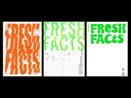
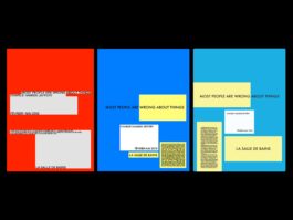
One project that I assigned in my class was the 256 project. This project was a topic that was shared across the thesis cohort. I gave students direction while still allowing them enough leeway to find their own way. The project involved collecting images through daily making and writing down details or thoughts about the photo at the time it was taken. Students built collections and organized them by a predetermined theme, as well as producing their own. They then documented details about each photo, such as the time, date, and size. Next, students were tasked with organizing the images in an editorial format, possibly for the first time, curating elements for others to view. They were asked to include their notes and any dialogue to explain why they shot what they did. The output was a hundred-plus-page book, and the outcome showed students excited to share their projects with others and include them in their portfolios. This project not only allowed students to develop their artistic skills, but also their organizational skills and their ability to communicate their ideas effectively.
Thesis 1 & Thesis 2 are year-long self-driven investigations into the research, prototyping, and design of an identified question, critique, or point of view. It provides an opportunity for design innovation and inquiry through the rigorous research and development of a capstone project, through various pathways across platforms. The goal of the first semester is to research, develop and articulate a thesis concept and create experimental prototypes, including designed presentations of research and process. Thesis 1, in particular, focuses on process, which includes primary and secondary research, ideation, prototyping, documenting, and writing about one’s own work. Students will be asked to reflect on how their ideas—as expressed through design—sit alongside historical precedent and shapes culture in the present. It provides an opportunity for visual innovation through the development of a rigorous design process.
Student:
Carmen Pleitez


Student:
Germaine Mai


Student:
Ivy Kurniawan


Student:
Jacy Chen


Student:
Kelly Liu


Student:
Nora Lombardo


Student:
Oz Osborn


Student:
Sarah Kim


Student:
Sofia Cacho Sousa


Student:
Aaron Deng


Student:
Tarra Boroumandi


Student:
Zach Tinubu-Karch


Student:
Zeid Jaouni


Fall 2021 - Spring 2022 (Parsons School of Design)
PUCD 4206 Core 4 Thesis 1
Describe + Transcribe
(Left)
Original by João Araújo and Rita Huet
Described by Aaron Deng
(Center)
Transcribed by Carmen Pleitez
Described by Germaine Mai
(Right)
Transcribed byIvy Kurniawan

(Left)
Original by Guillaume Sbalchiero
Described by Nora Lombardo
(Center)
Transcribed by Oz Osborn
Described by Samantha Chun
(Right)
Transcribed by Sarah Kim

(Left)
Original by Maziyar Pahlevan
Described by Sarah Kim
(Center)
Transcribed by Sofia Cacho Sousa
Described by Tarra Boroumandi
(Right)
Transcribed by Zach Tinubu-Karch

(Left)
Original by Caleb Halter
Described by Juriel Furukawa
(Center)
Transcribed by Kelly Liu
Described by Nora Lombardo
(Right)
Transcribed by Oz Osborn

Fall 2021 - Spring 2022 (Parsons School of Design)
PUCD 4206 Core 4 Thesis 1
Experiments I & II
04. Experiment I & II
Students were set to create a prototype in one medium that explores their question, critique, or point of view from the learnings in early practices. Students should have a specific audience in mind. They then identify and document precedents in all media that pose a similar exploration, and give other students feedback on approach, context, history, and audience.
Aaron Deng
Ex.1
Analog Digital
—
Sensor
—
A System
/
Documentation of Converting
/
A Fictional Software


Aaron Deng
Ex.2
Circulation of Matter


Juriel Furukawa
Ex.1
Identity Cloaking


Juriel Furukawa
Ex.2
Study of Time Travel and Escapism through the Color Green


